Update! We submitted this project for the UN Global Pulse Data for Climate Action competition and won the Thematic Award for Climate Mitigation at COP23 in Bonn, Germany! :)
Recent advances have seen the development of near-real time monitoring tools that report on the state and changes in vegetation based on satellite observations, e.g. globalforestwatch.org. These tools are hugely valuable for managing ecosystems and for developing the long term records required to understand ecosystem dynamics and trajectories of change.
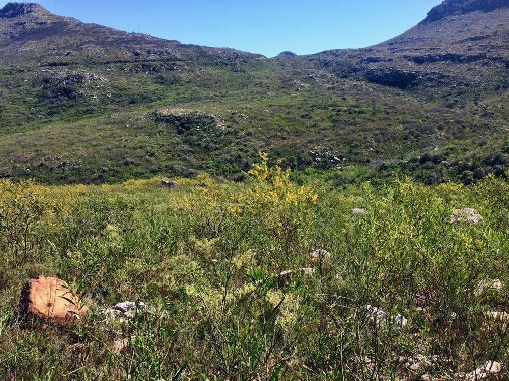
Unfortunately, near-real time vegetation change detection tools are largely limited to forests. As far as I know, none exist for non-forest ecosystems such as the shrublands, woodlands and grasslands that dominate South Africa and much of the rest of the globe.
Detecting abnormal change in these ecosystems is highly challenging. The state of the vegetation varies dramatically due to natural disturbances, long-term trends or cyclical functions, such as those relating to fire, postfire recovery or seasonality.
If one just looks at the deviation in the signal of vegetation greenness/health (using MODIS NDVI) from some base period, you can get quite a mess. Below I’ve used Climate Engine to calculate and display the difference in the mean vegetation greenness over the past 60 days relative to the long term average 2000 - 2017, focusing on the Fynbos region.
Splotches of red and blue all over the place! The red splotches mostly represent areas that are recovering from recent fires. Since fynbos typically burns every couple of decades or so, very few sites have burnt more than once in our 2000 - current record, and are thus below the long term average. Most of the blue splotches (higher than average greenness) are agricultural areas, but there are interesting ones like the currently empty Theewaterskloof Dam (the bright blue splotch near Villiersdorp!), and, for those in the know, some areas where very dense woody alien plant invasions have been expanding.
The key missing ingredient here is accounting for postfire recovery. We don’t want to compare the observed vegetation signal against the long term average at that site, we want to compare it to the expected signal at that site for the age of the vegetation since the last fire and that time of year.
Fortunately, one of my collaborators on this project, Adam Wilson, has already worked out a great way estimate the expected signal in this great paper. He modelled MODIS NDVI as a function of vegetation age since the last fire rather than time, providing a postfire recovery trajectory where NDVI initially increases with age and then saturates after a few years, presumably as plants become large enough to have abutting canopies.
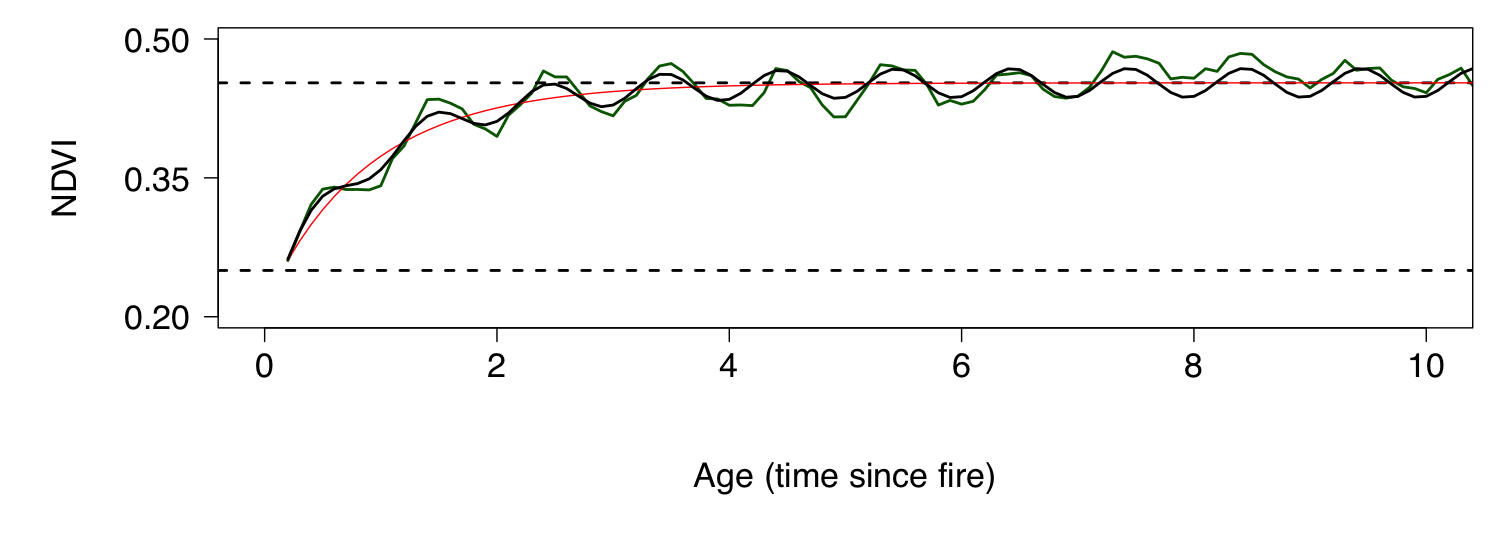
The postfire recovery curve can be modelled as an exponential function that increases to an asymptote (red line in the figure), to which one can add seasonality by combining it with a sine function (black line).
Fitting this model allows one to estimate the parameters of the curve, which mostly have relatively intuitive interpretations like the rate of vegetation recovery, the maximum vegetation greeness, the amplitude of the seasonality etc. - the focus of Adam’s paper. By the by, we can use these parameter estimates to make predictions for the expected vegetation greenness for a given vegetation age. Comparing new satellite imagery to these predictions allows us to identify unexpected deviations in near-real time…
But first, Adam took his model one step further, not only deriving the curve parameters, but simultaneously estimating their dependence on the environment at each site (climate, soils, topography) - using a Hierarchical Bayesian framework (for the interested nerds among you). This has several advantages in that it extends the ability of the model to infer recovery trajectories for cells with no or patchy data, but it also constrains the estimated curve parameters by the environmental covariates, reducing the influence of any sites that have errors in the data, or that have already suffered negative impacts (e.g. ploughing or alien plant invasion).
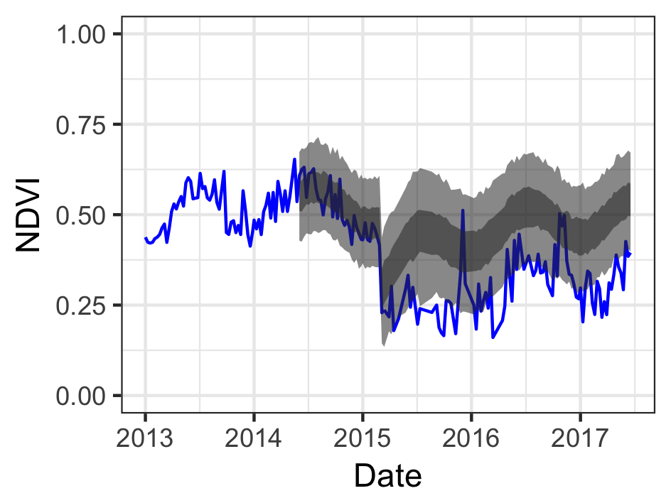
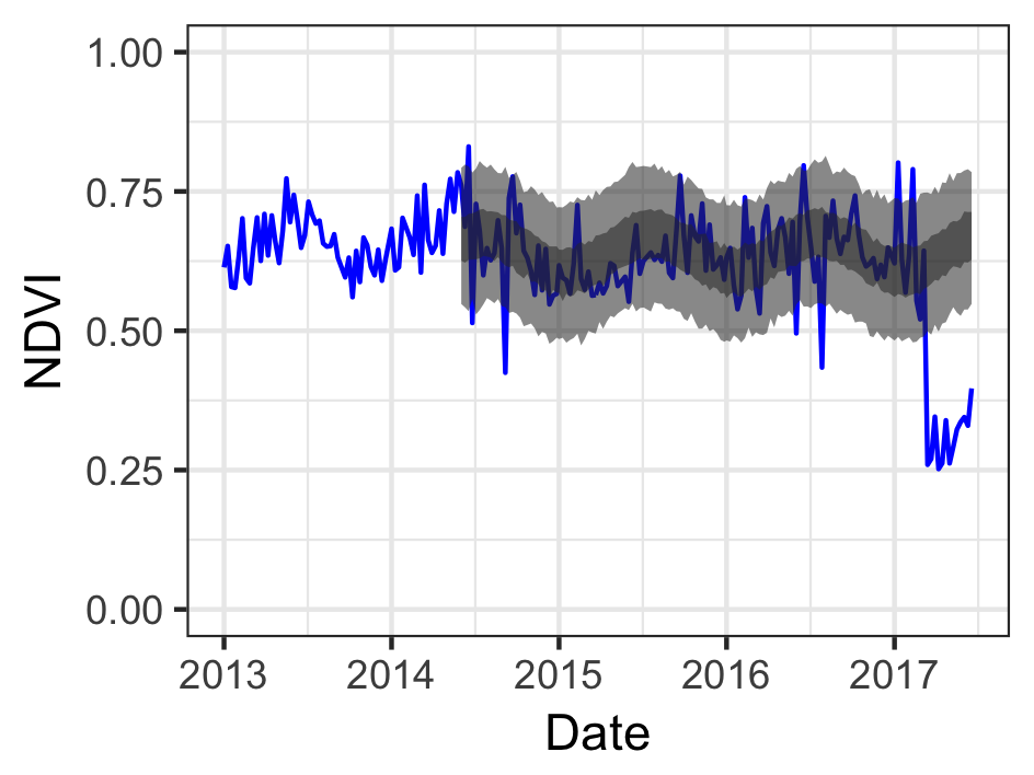
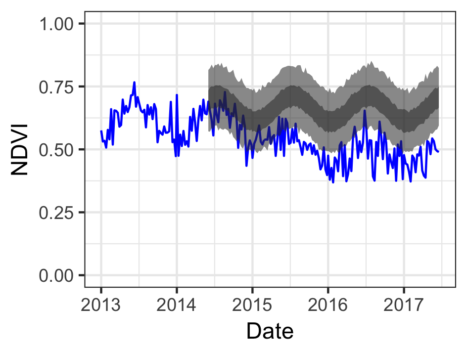
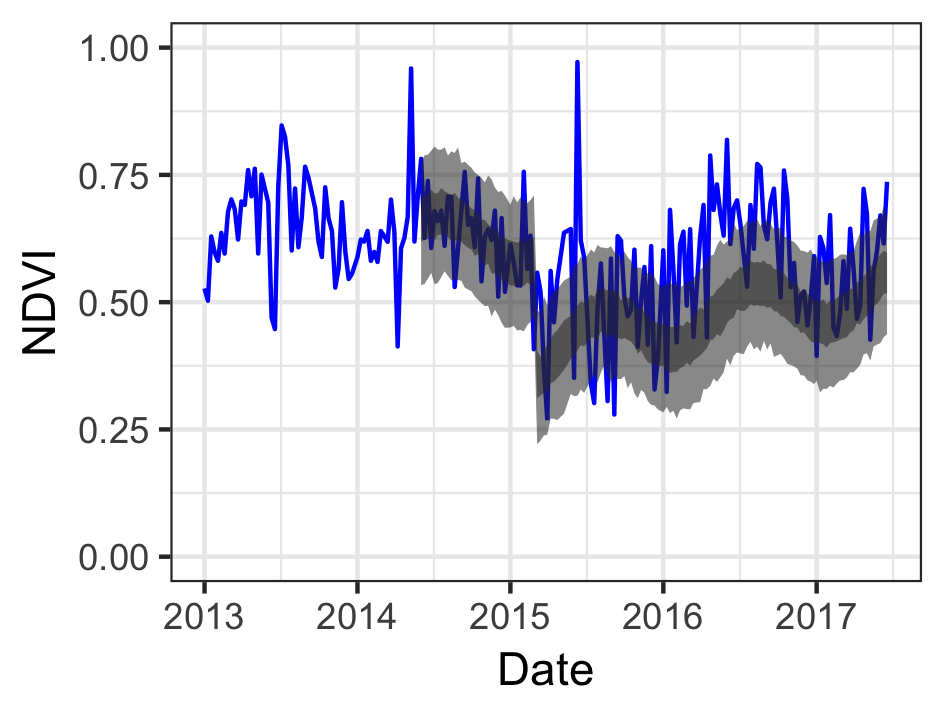
Here we see the confidence intervals of the model prediction (50% = dark grey band, 95% = light grey) and the observed data (blue) for a site in the Cape of Good Hope Section of Table Mountain National Park. We fit the model on the 16-day combined MODIS NDVI data for both the Terra and Aqua satellites (i.e. one scene every 8 days) from February 2000 to the end of May 2014 (before the current drought started) and projected to “current” (end of July 2017). This site burnt in March 2015, and it is clear that the postfire recovery has been much slower than we’d expect, likely due to the drought.
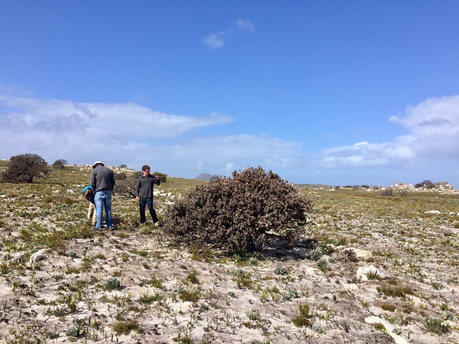
A field inspection revealed that this is indeed the case, and that many individuals of the fire-resistant shrub Mimetes fimbriifolius, which is common at the site, have recently died.
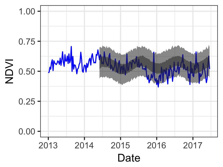
Feeling buoyed by this success, we ran the model for the whole of Table Mountain National Park (or at least the bits that we could get good data for without too much effort), highlighting sites that showed multiple deviations below or above the 95% confidence interval of the model predictions since January 2017.
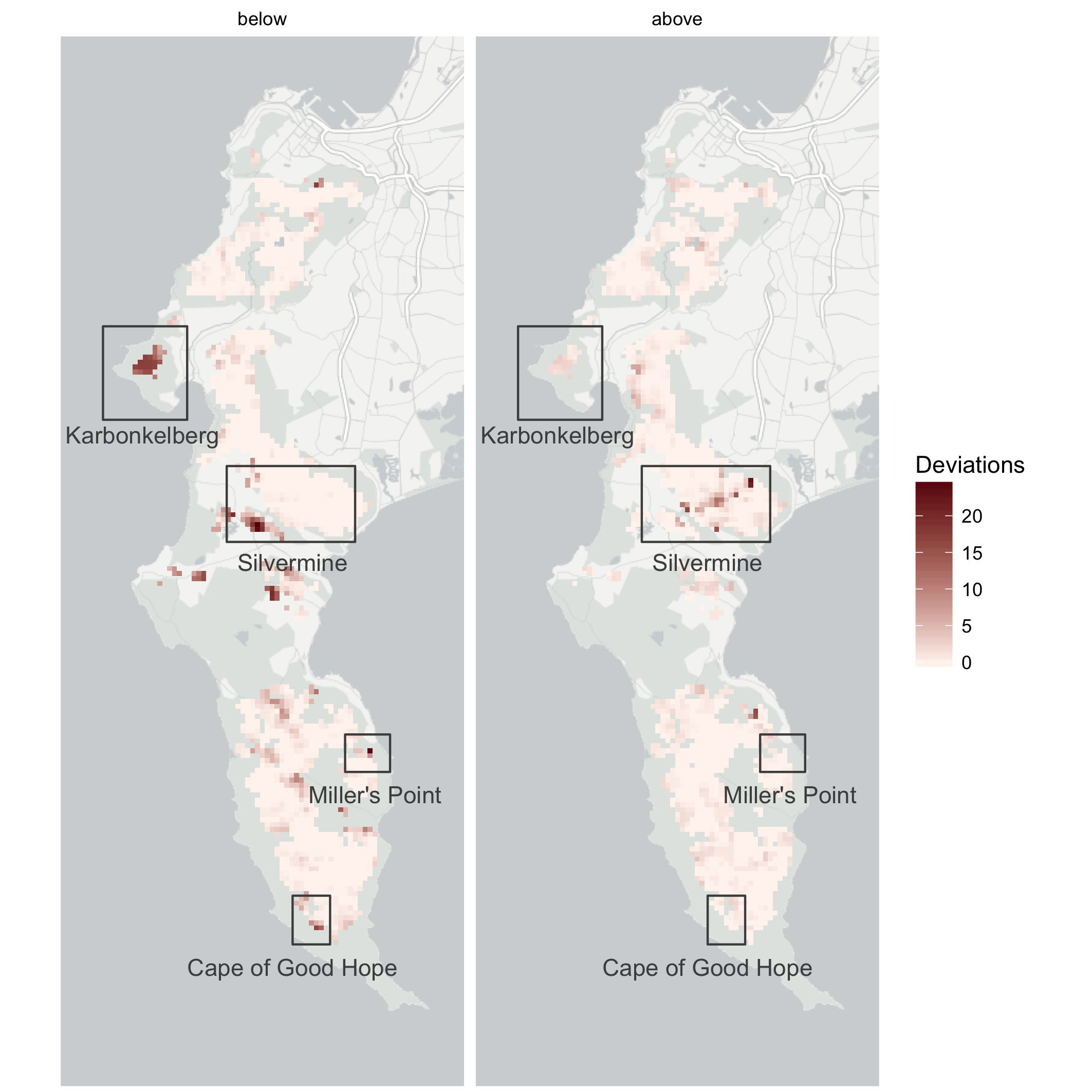
While some of the highlighted areas were clearly due to poor input data, such as incorrect land cover classification, most appear to be genuine shifts in the vegetation state. I’ve highlighted a few examples to discuss below, other than the Cape of Good Hope site, but feel free to peruse the interactive versions of these maps at the end of this post.
Karbonkelberg
A large part of the Karbonkelberg was highlighted as being far less green than the model predicted. This is the kind of pattern one would expect to observe due to fire…
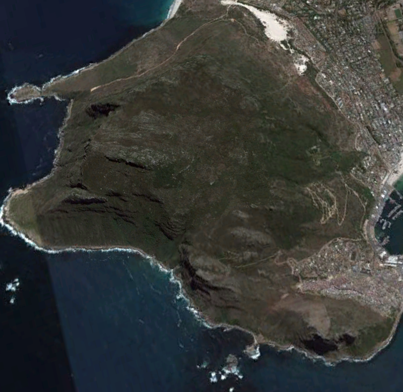
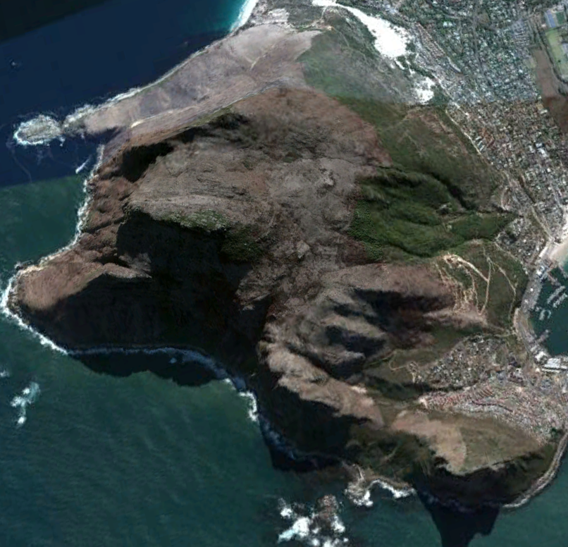
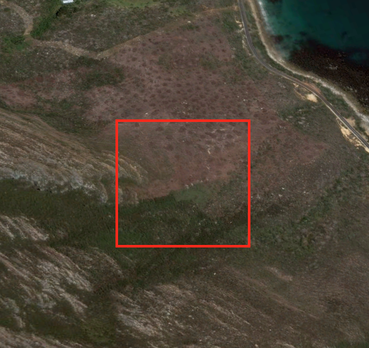
…which in this case is easily confirmed with a couple of “before” and “after” Google Earth screen shots. Note the clear steep drop in NDVI signal too. Unfortunately, Google Earth don’t always update their imagery all that frequently, so it’s not necessarily useful for diagnosing impacts in near-real time (i.e. every 8 to 16 days). Commercial imagery providers like Planet.com provide very high resolution imagery (3m!) every few days, but probably come with a hefty price tag…
Silvermine
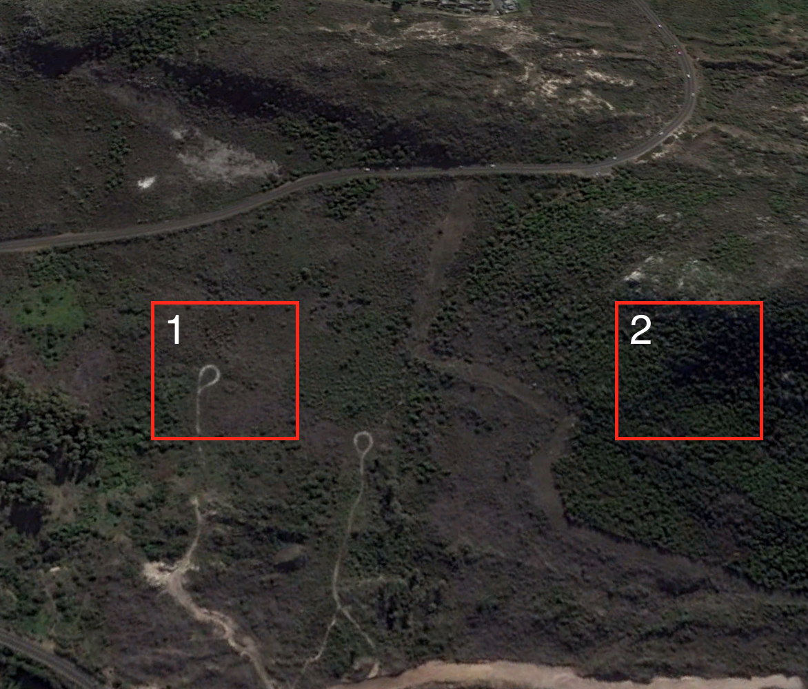
There were a few different sites highlighted in the Silvermine area, but for different reasons. The NDVI time series below look near-identical, but with a bit of imagination you may notice subtle differences.
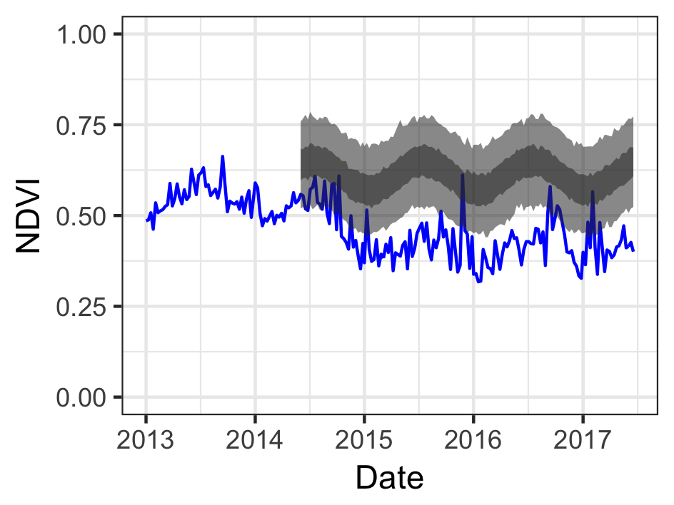
The time series on the left (site 1) shows a step change around January 2015, and digging through the Google Earth imagery (below) reveals that this was due to partial vegetation clearing around that time as part of the development of a luxury housing estate. The time series on the right (site 2) perhaps shows a more gradual decline, with deviations starting around May 2015, during the driest winter in Cape Town on record, and becoming progressively worse.
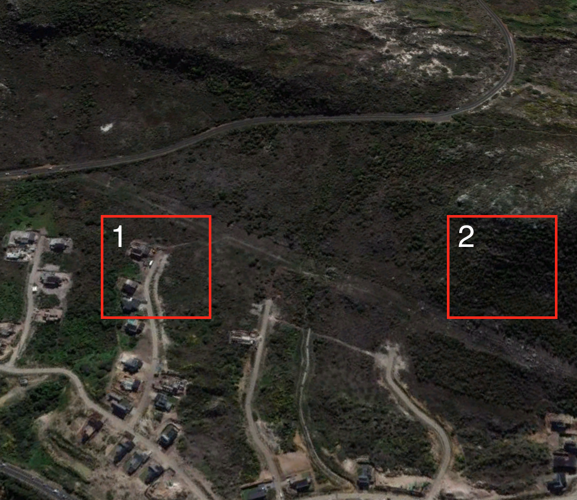
No impact is evident from the satellite imagery, but a site inpection revealed that a high proportion of the plants at this site have died, likely due to the ongoing drought.
Silvermine also included a large number of sites that deviated above the expected signal, showing faster recovery after a fire in March 2015 than the model predicted.
A field inspection revealed a dense invasion of young Australain Port Jackson Willow, Acacia saligna.
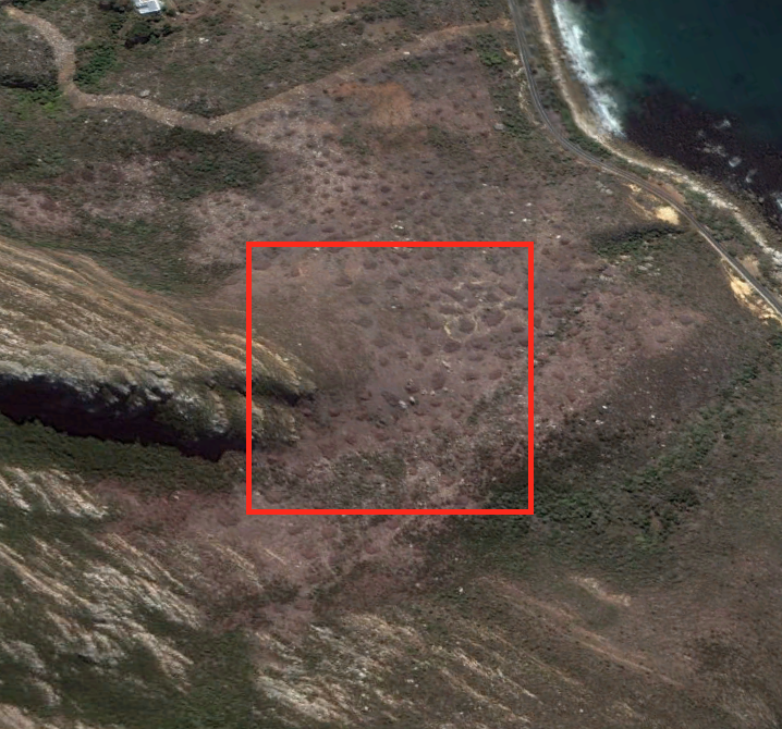
Miller’s Point
Lastly, a site near Miller’s Point showed a subtle reduction in greeness, which turns out to be due to ongoing invasive alien plant clearing operations.
Conclusions and where to from here?
This preliminary analysis is very positive and it seems the system has potential to be a valuable asset to any land manager for a range of applications from highlighting illegal clearing of indigenous vegetation or identifying spread of invasive alien species to monitoring invasive plant control operations.
We’re busy working on a number of improvements and refinements, and are trying to collect enough data to do a proper validation of the system’s abilities1. For this we plan to run the model for the whole of the Cape Floristic Region, as this should highlight many areas where potential impacts have occurred. Hopefully it’ll give us insight into the spatial variation in the impacts of this drought too…
If the model validation looks good, then its a matter of working out how to launch and run an operational system for the Cape Floristic Region of South Africa. Should this prove successful, we could look to expanding to additional non-forest ecosystems in South Africa and elsewhere :)
To aid in field data collection and rapid assimilation and analysis we’ve been working on developing a Smartphone App that can be used by citizen scientists, field rangers and landowners to map threats to and impacts on biodiversity, by marking a specific GPS location, taking images and adding notes.↩